
No handoff
Each zone may be attractive, but the eye cannot find a color, material or shape that travels between them.
The open-plan relay / Living + dining
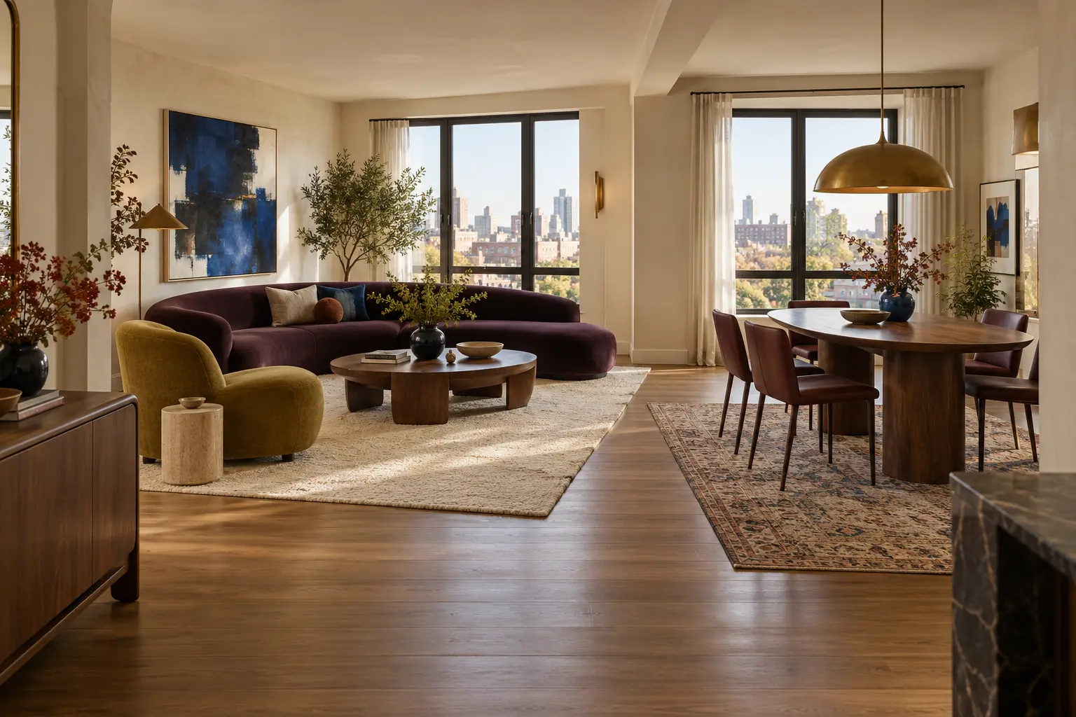
Repeat exactly three visual bridges across the shared sightline—one color, one material and one shape—then give each zone one deliberate contrast. Keep the walking route clear and let function set the furniture. The rooms will relate without reading as a matching suite.
1. Name the real problem
Each zone may be attractive, but the eye cannot find a color, material or shape that travels between them.
Matching finishes, lighting and upholstery erase the reason for having two zones. Repetition becomes a furniture set, not a relationship.
Every large object asks to be the focal point. The bridge exists, but it cannot be heard over two loud palettes and several dominant patterns.
The arrangement looks connected only because furniture or rugs have consumed the route. Visual unity cannot come at the expense of everyday movement.
2. The zero-dollar doorway audit
Include both zones and the path between them. A doorway view exposes competition that close-up styling hides.
Write the visible colors, materials and shapes in each zone. Circle only what already appears on both lists.
Walk from entry to every chair, door and working surface. Tape the route edge where a rug or table keeps drifting into it.
Take away portable objects that introduce extra finishes. Restore only pieces with a function, meaning or bridge role.
Borrow a cushion, vessel, book or small table from one zone. View the result from all normal seats and again after dark.
3. The original three-bridge relay
The bridge should change as it travels. Repetition is most convincing when the second appearance is related in color, material or geometry but different in object, scale or texture.
Repeat one small color note across the sightline—not the whole palette.
A cobalt artwork in the living room and a cobalt vessel on the dining table.Let one material appear in both zones at different scales or depths.
A walnut coffee table and a darker walnut dining table, separated by two different rugs.Repeat a geometry, not an identical product family.
The soft curve of a coffee table returns in an oval dining top and domed pendant.Then add one contrast per zone: a pale high-pile living rug against a patterned flat dining rug; plush seating against slender chairs; one large blue artwork against a quieter dining wall. Contrast gives each zone an address.
4. Symptom to decision
Use the free test first. A purchase is justified only when it fills a bridge or function you can name in one sentence.
| What you see | Free test first | If a purchase is still useful | Avoid |
|---|---|---|---|
| The zones look like separate apartments | Photograph both from the main threshold; circle one color, material and shape already visible in each | Repeat the strongest missing bridge once in the quieter zone | Buying paired lamps, tables and chairs to force agreement |
| Everything matches and the room feels flat | Remove one matched accessory from each zone and restore only the useful one | Give each zone one deliberate contrast in rug, upholstery or art | Adding more pattern before restoring hierarchy |
| The living room dominates | Lower its visual volume: edit small objects, turn a loud chair inward, simplify the rug edge | Give dining one vertical anchor such as art or an appropriately placed fixture | Competing with a second oversized focal point |
| The dining set looks marooned | Center its rug and lighting on the table, not on the entire open floor | Carry one living-room bridge to the table or wall | Stretching the living-room rug into the dining route |
| The room only works from one angle | Take doorway, sofa and dining-seat photos; mark what interrupts the route or sightline | Choose the solution that survives all three views | Styling for a single photograph |
| Color shifts between daylight and evening | Move the existing textile or sample between zones for a full day | Buy only after the color still relates under both light conditions | Trusting a phone screen as proof of color |
5. Worked example / 13 × 24 feet
A 13-by-24-foot connected room has an aubergine sofa and chartreuse chair at one end, a walnut oval dining table with oxblood chairs at the other, and continuous warm wood flooring. The household uses the center lane to reach a balcony door.
The dimensions illustrate the relay method, not a universal clearance or furniture rule. Door swings, actual occupants, mobility devices and product instructions can require a different plan.
A useful purchase, not a matching purchase
Low-cost movable color
IKEA's U.S. page currently lists the foldable dark-red table at 19⅝ by 15¾ inches, 20⅛ inches high and $39.99. It is an example of a portable color echo that also gives a seat a surface—not proof that it fits your route, height, color or household.
Check current dimensions, price and local availabilitySample before changing walls
Sherwin-Williams advises viewing paint samples under changing natural and artificial light. That matters more in an open plan because the same color can sit beside different windows, bulbs and fixed finishes. A movable sample board is more informative than a screen swatch.
Read the official color-selection guidanceOrdinary non-affiliate links; no sponsorship, paid placement, product test, stock claim or brand relationship is implied. Price and specifications were checked October 8, 2026 and can change; confirm the current listing before purchase.
When this advice does not apply
Access: do not narrow a route to make the rugs or furniture look more connected. The U.S. Access Board's 36-inch continuous clear-width requirement applies to covered accessible routes, not as a blanket private-home decorating rule; it is useful context when planning for a household member who needs an accessible path. Turns and individual mobility devices may need more.
Architecture: a kitchen work aisle, door swing, hearth, radiator or required egress is not available styling space. Treat the fixed condition first, even if the visual bridge becomes less symmetrical.
Tall dividers: open shelving can zone a room but may obstruct light, view and movement. Furniture with drawers, doors or shelves also needs the manufacturer's placement and anchoring instructions; CPSC's Anchor It! campaign emphasizes anchoring those furniture types to help prevent tip-overs.
Strong existing rooms: if architecture, art or a continuous floor already connects the plan, stop at one or two bridges. The method is a diagnostic ceiling, not a quota.
The nine-answer buying brief
Primary government, manufacturer and merchant sources checked October 8, 2026. The three-bridge relay, doorway audit, relay score, decision table and worked room are original editorial planning devices. They are not accessibility standards, space-planning codes, product tests or a completed-client result.
Merchant and manufacturer links are ordinary references selected for reader usefulness. No affiliate tracking, sponsorship, paid placement, hands-on testing, audience metric, completed-client work or guaranteed availability is claimed.
Read our editorial standards · Relevant brand partnership inquiries